Why

A starting point for my own apps.

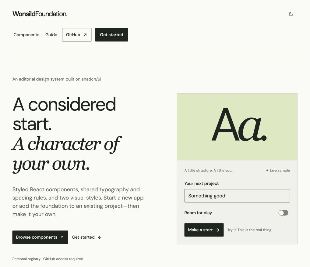
I built WonsildFoundation because I wanted a consistent starting point for my own apps. It brings together styled React components, shared layout rules and a shadcn registry, so useful design decisions carry into the next project instead of being made again.

Each project gets its own copy. A font, colour or component can change for that app without changing the original foundation.

Type and spacing

Rules that come with every new app.

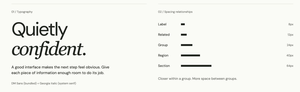
Typography, colour and spacing are defined once and shared by every component. Spacing uses five named roles, from 8 px between a label and its field to 64 px between sections: closer within a group, more space between groups.

Editorial typography sample beside five spacing roles: label, related, group, region and section.
Shared typography and spacing relationships give new screens a consistent starting point.

Components

Controls, and a screen built from them.

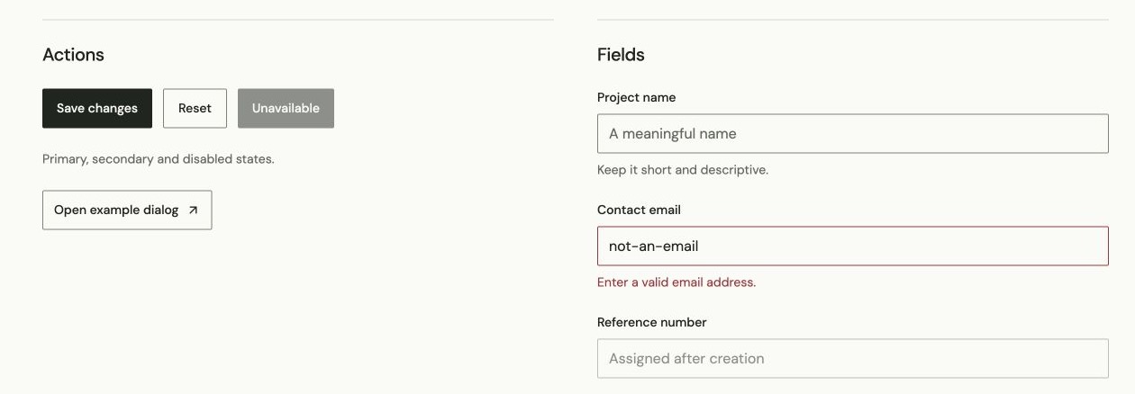
Buttons and form fields showing default, invalid and disabled states in the Editorial style.
Primary, secondary and disabled actions, alongside helper text and validation states.
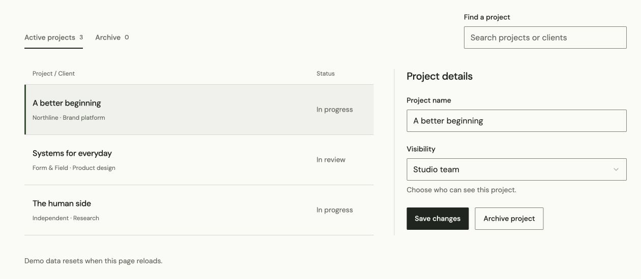
A searchable project list with a selected row and a project-details form with save and archive actions.
A project workspace composed from the system, using session-only demo data.

Styles

Two styles, light and dark.

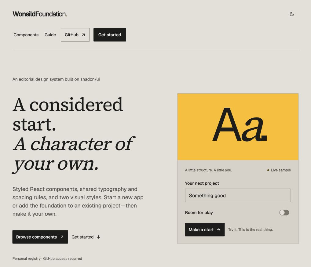
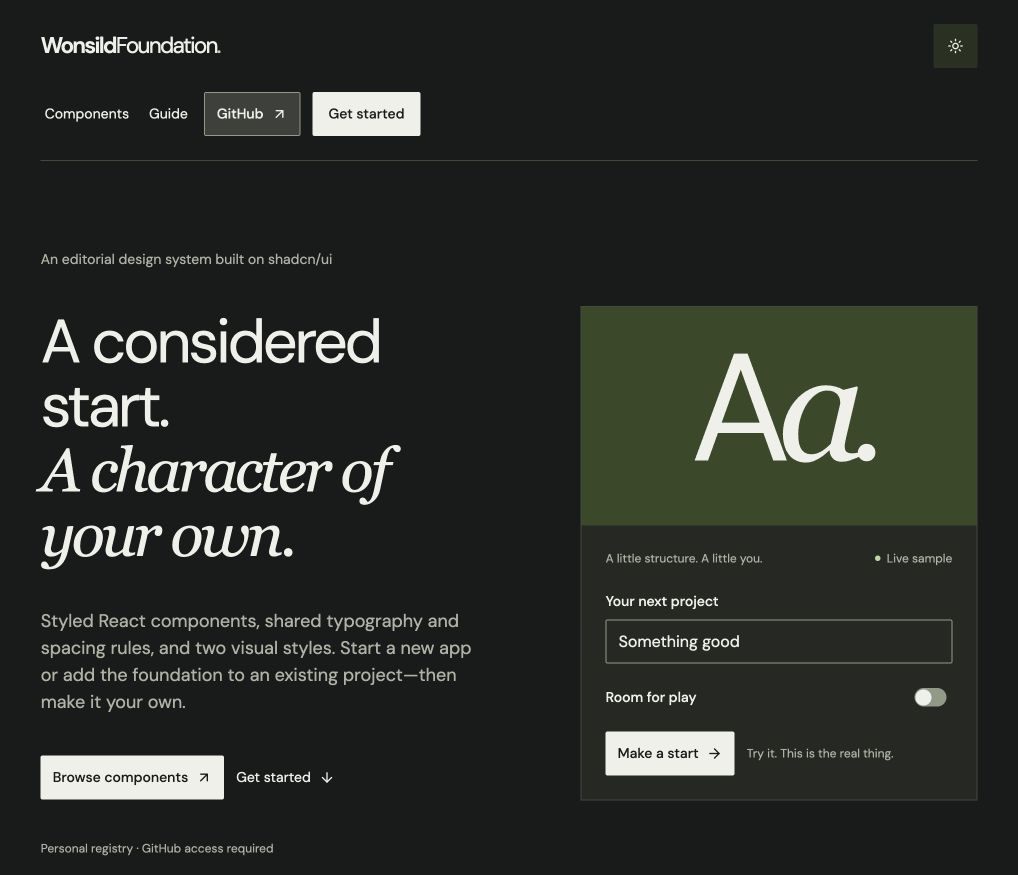
Editorial uses paper tones and a soft olive accent. Stone uses warm neutrals and a serif pairing. Both use the same components and both work in light and dark mode.

Using it

Three ways to start.

Availability

The live demo shows the landing page, the component reference and both styles. The source and install instructions are in the GitHub repository. This page describes version 0.5.1.

Built with

React TypeScript Tailwind CSS shadcn/ui Radix UI